The interesting change in embroidery this year isn’t happening in the design file. It’s happening in the pricing conversation.
For several seasons, stitched decoration coasted on warmth. Nostalgic florals, folk borders, a general feeling that thread signalled care. That mood is still around, but it stopped being enough somewhere in the last eighteen months, for a reason that has nothing to do with taste.
Printing got very good. Direct-to-film and pigment work now reproduce colour, gradient and fine linework at a quality that would have been described as impossible a decade ago, at a fraction of embroidery’s cost. Anything embroidery does flatly — a logo, a picture, a word — can now be printed better and cheaper.
So the trends that matter in 2026 are the ones printing cannot touch: height, weight, shadow, irregularity, and the sense that a human made a decision. That is the frame for everything below.
Featured Snippet Answer
The biggest embroidery trends to watch in 2026 are dimensional and 3D puff texture, tonal and micro logos, reworked heritage motifs, recycled and low-impact threads, new-generation iridescent metallics, mixed-media layering with appliqué and print, unexpected placement, and made-to-order personalisation. Texture and restraint drive all of them.
How This Article Works
Most trend pieces hand you a list and stop. Lists don’t tell you what happens when four of those trends land on the same garment, or which one quietly loses money.
So this article follows a working year instead. The studio described below — Halden & Kestrel — is an illustrative composite, not a real reported company. Every technique, material behaviour and commercial pattern is drawn from how embroidery actually works. The studio simply gives them somewhere to happen.
It’s a small operation of the kind you’d find in almost any country: two machines, a handful of people, clients scattered across three continents.
Caption: read it as a season diary with the trend names written in the margin.
The Working Year At A Glance
- Early in the year — the brief is rewritten around surface rather than subject
- Development — heritage and regional craft references taken apart and rebuilt
- Sampling — dimensional stitch tests, foam versus no foam
- Sourcing — thread decisions, sustainability, the metallic retest
- Refinement — tonal marks and placement experiments
- The difficult month — mixed media, and one garment that went wrong
- Systems — personalisation built as a constrained menu
- Selling season — what customers actually reached for
Phase One: The Brief, And Why Texture Beat Subject Matter
The year opened with the studio planning to repeat itself. Large botanical designs had sold reliably twice running, and the reorder sheet said keep going.
The argument that changed the brief came from a stockist in a different market entirely, who put it simply: the flowers were lovely, and a printed version of the same flowers would sit on the next rail at half the price.
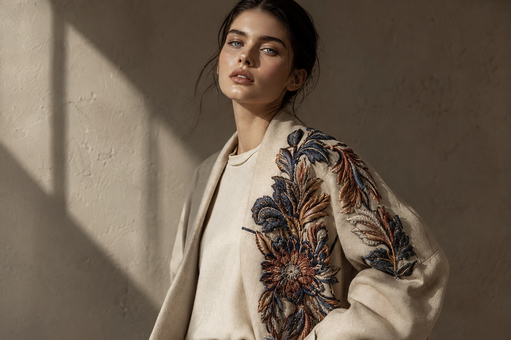
That is the whole 2026 problem in one sentence. The studio rewrote its brief around a single test — would a customer’s hand register this before their eye did? Subject matter dropped to second place. Surface came first.
Caption: the development board that year held almost no artwork. It held stitched swatches pinned directly onto fabric.
The lesson from Phase One: the strongest embroidery decision available in 2026 is a decision about texture, not imagery. Depth, height and irregularity are the only qualities that reliably survive comparison with a good print — and they’re the qualities that read instantly in a photograph on a small screen, which is where most buying now begins.
Phase Two: Heritage Embroidery Motifs, Rebuilt Rather Than Repeated
The studio still needed a visual language, and like much of the trade this year, it went looking backwards to find one.
Craft traditions are everywhere in current embroidery. Counted geometric work from Eastern Europe, running-stitch repair traditions from East Asia, whitework and shadow work from South Asia, bold colour-blocked figurative embroidery from Central America, monastic crewelwork and heraldic crests from Western Europe. All of it is being mined.
What separates the good work from the tired work is treatment. A tradition reproduced exactly reads as fancy dress. A tradition taken apart — one element pulled out, rescaled, recoloured, relocated — reads as design.
Halden & Kestrel took a repeating border, isolated a single motif from it, enlarged it well past its original proportions and ran it down one sleeve seam only. The heritage was intact. The garment was entirely contemporary.
Caption: the archive reference and the finished sleeve, photographed together. The relationship is obvious and the resemblance is not.
There’s an ethical dimension here that the industry has become noticeably more careful about. If you’re drawing on a living regional craft, name it, understand what its elements mean, and don’t flatten several distinct traditions into one vague decorative style. Audiences across every market now spot that immediately, and the correction is public.
The lesson from Phase Two: modernise the treatment, never the tradition. And keep a note of what you referenced — it becomes the story you sell with.
Phase Three: 3D Puff Embroidery And The Dimensional Stitch Tests
Sampling month produced the year’s defining technique, and also its most misunderstood one.
Raised embroidery — foam laid under a dense satin stitch so the design stands physically off the fabric — has become the most reliably ordered commercial technique of the year, particularly on structured caps and heavy outerwear. Its appeal is practical before it is aesthetic. Height casts a shadow, and a shadow cannot be printed.
The studio ran three variations.
Bold puff. Tall foam, chunky lettering. It worked beautifully on caps and heavyweight sweats and failed everywhere else — on lighter cloth the foam fought the drape and the garment hung wrong.
Low-rise refined puff. Shallower foam, tighter density, cleaner edges. This is the version that defines 2026. It keeps the tactile effect while shedding the loud streetwear association, which widens its commercial range enormously.
Built depth with no foam at all. Layered satin, couching, seed and knot stitches stacked to create height through thread alone. Slowest, dearest, and by some distance the best-looking sample in the box.
Caption: three swatches photographed under a single low light. The one with no foam throws the most interesting shadow.
The lesson from Phase Three: puff is really three techniques serving three different customers. Sample the refined version first — it travels across far more product categories, and it photographs like a premium detail rather than a novelty.
Phase Four: Sustainable Embroidery Thread And Metallics Worth Retesting
Thread used to be the least interesting decision in the process. This year it became a line on the product page.
Recycled polyester, organic and responsibly grown cotton, regenerated cellulose fibres and lower-impact dye processes have moved from optional to expected — fastest in European markets, but the expectation is now visible almost everywhere, and it arrives earlier in the conversation than it used to.
Embroidery also holds an advantage here that the trade under-sells: decorating with thread consumes almost no water compared with most dyeing and printing routes. That is a genuine selling point, and it costs nothing to state.
The studio switched its base thread to a recycled polyester and lost a slice of its colour range in the process. It gained something worth more — a claim customers actually read before buying.
Then the metallics, which most small studios had written off years ago after enough shredding, snapping and tension misery to last a career. Modern iridescent and colour-shifting threads are constructed differently and behave differently. They run at commercial speed without constant intervention, and they’ve largely pushed flat gold and silver aside on premium work.
Caption: the iridescent sample reads violet from one side and green from the other. It sells itself in a photograph.
The lesson from Phase Four: retest metallic thread even if it burned you before, because the material genuinely changed. And treat responsible thread as commercial equipment, not a compliance cost.
Phase Five: Tonal Embroidery Logos And The Discipline Of Being Quiet
This was the phase the studio nearly skipped, and it produced the year’s best-selling piece.
Running directly alongside all that texture is a strong counter-movement toward restraint. Large contrast chest logos are receding. What’s replacing them: thread matched exactly to fabric colour, marks under two centimetres, single-weight line drawings, and placement in positions where branding doesn’t normally appear.
Placement has effectively become a trend in its own right. Inside collars. Hem corners. Cuff edges. The back of a shoulder. A side seam. The mark is discovered rather than displayed, which flatters the wearer rather than the brand.
Halden & Kestrel stitched its name into the left hem of a plain heavy tee in thread identical to the cloth. Zero colour contrast. The design exists only as texture and shadow.
Caption: from a metre away, nothing. From arm’s length, the most considered thing in the range.
There’s a production trap in this. Tonal and micro work is brutally unforgiving — with no colour contrast to hide behind, every density miscalculation and every registration drift is visible. Small and quiet needs more digitising care than large and loud, not less.
The lesson from Phase Five: subtlety is a technical skill with a cost attached. Price it accordingly, and never treat a small design as a quick one.
Phase Six: Mixed Media Embroidery, And The Garment That Went Wrong
One month of the year went badly, and it went badly in a way worth documenting.
Mixed media is one of 2026’s real growth areas. Stitching combined with appliqué, woven or leather patches, chenille, print underlays and layered fabric produces depth no single method reaches, and hybrid pieces command genuine premiums because of it. Appliqué in particular has come back hard, for the unglamorous reason that layering cloth covers area far faster and cheaper than stitching it solid.
The studio’s error was enthusiasm. One jacket carried raised lettering, an appliquéd back panel, metallic accent work, a heritage cuff border and a printed base layer.
It didn’t look rich. It looked like five samples arguing.
The rebuild kept one technique as the lead and reduced everything else to supporting scale. That version shipped and sold.
Caption: the overloaded prototype stayed pinned to the wall all year as a warning.
The lesson from Phase Six: mixed media works when one method leads and the others defer. Choose the hero technique before sampling, not after — and count the labour honestly, because hybrid construction eats hours in places the quote never anticipates.
Phase Seven: Personalised Embroidery And Small-Batch Production
Personalisation has stopped being a trend and become the delivery mechanism every other trend now travels through.
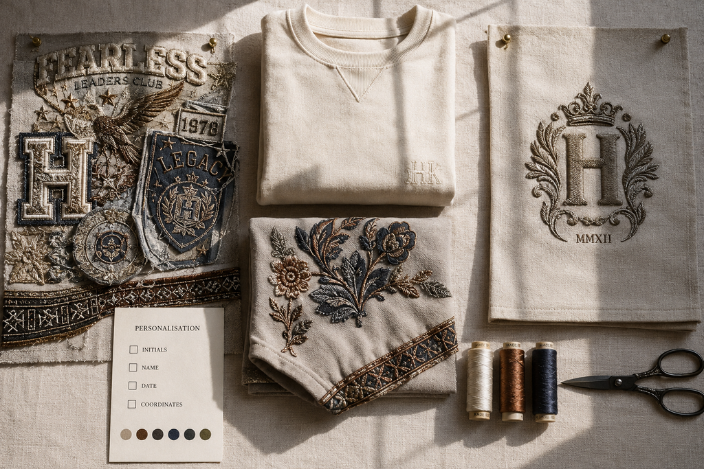
Faster machines, better digitising software and direct ordering have pushed viable batch sizes down to genuinely small numbers. Initials, names, dates, coordinates, short private messages inside a collar — customers across every market now expect the option, and they pay more for the same garment with it than without.
Halden & Kestrel built a deliberately narrow system: three typefaces, six thread colours, four placement positions. Anything outside that grid was quoted separately as bespoke.
The constraint is the entire trick. Open-ended personalisation destroys small studios through setup time and approval emails. A tight menu keeps production repeatable while still feeling made-for-you at the customer’s end.
Caption: the personalisation card packed with every order. Four boxes to tick and nothing else.
The lesson from Phase Seven: design your personalisation options as a product with hard edges. The margin lives inside the limits, not outside them.
Phase Eight: What Customers Actually Reached For
The selling season produced a pattern that repeats across a lot of small studios, which is why it’s worth stating plainly.
The heavily textured hero pieces sold slowly at full price and never needed discounting — they behaved like considered purchases rather than seasonal ones. The tonal minimalist tee outsold everything else repeatedly, mostly to customers who never mentioned embroidery at all. The mixed-media jacket sold out and barely made money once the real hours were counted.
The rebuilt heritage sleeve motif from Phase Two became the studio’s signature and was carried into three other garments the following season.
Caption: sell-through by piece. The quietest design has the tallest bar.
The lesson from Phase Eight: texture wins attention, restraint wins volume, and heritage wins the long game. A balanced range in 2026 needs all three in different proportions — and the pieces that get photographed are rarely the pieces that pay the rent.
The Trends That Are Fading
Worth saying, because trend lists only ever add.
- Large flat single-colour chest logos. Still ordered constantly. No longer premium.
- Literal reproduction of vintage designs. Reads as costume without a modern treatment.
- Older flat metallic threads. Superseded by iridescent alternatives that actually run.
- Undifferentiated maximalism. Dense stitching is very much alive, but it now needs a focal point instead of filling every surface evenly.
- Embroidery used purely to reproduce a picture. That’s a job print does better and cheaper now. Use thread for what thread alone can do.
Key Takeaways
- Texture is the headline of 2026 — depth and shadow are what printing cannot copy.
- Refined low-rise puff has far wider commercial range than bold streetwear puff.
- Tonal, micro and hidden-placement marks are quietly outselling loud branding.
- Heritage motifs need modern scale, palette or placement — and honest crediting.
- Responsible thread is a sales asset, not a box to tick.
- New-generation iridescent metallics run reliably. Retest them.
- Mixed media needs one hero technique and supporting roles for the rest.
- Personalisation belongs inside a narrow menu with fixed fonts, colours and positions.
Frequently Asked Questions
What Is The Most Popular Embroidery Technique In 2026?
Raised and 3D puff embroidery is the most consistently ordered commercial technique, especially on structured headwear and heavier garments. Its dominance is practical rather than fashionable: physical height casts a real shadow, and no printing process can reproduce that. It’s the clearest visual proof that a garment was decorated rather than printed.
Is Hand Embroidery Or Machine Embroidery More In Demand Right Now?
Both, at opposite ends of the market. Machine embroidery leads commercially because personalisation and small-batch ordering depend on speed and repeatability. Hand embroidery leads at the premium end, where visible irregularity and evident labour justify high prices. The most interesting current work sits between the two — machine-stitched foundations finished by hand.
Which Embroidery Colours Are Trending For 2026?
Two directions dominate. Muted, earthy grounds carrying a single saturated accent, and full tone-on-tone schemes where thread matches fabric exactly. Iridescent and colour-shifting threads function as a separate category altogether, since their hue changes with viewing angle rather than sitting as a fixed gold or silver.
Can Beginners Attempt The 2026 Embroidery Trends At Home?
Yes, in the right order. Heritage motifs, minimalist line work and simple monograms are all approachable early. Tonal stitching is deceptively difficult because no colour contrast exists to disguise mistakes, and raised puff genuinely requires foam, correct stabiliser and confident machine control. Build consistent stitch density on contrast designs first.
Is Embroidery Still Worth Starting As A Small Business In 2026?
The conditions are reasonable. Demand for personalised goods is high worldwide, minimum order barriers have collapsed, and stitched products hold their price better than printed equivalents. The real constraints are equipment cost, the steep digitising learning curve, and a saturated market for plain logo work. Differentiation comes from technique, not from owning a machine.
How Do You Keep Embroidery From Looking Dated Within A Year?
Anchor the design in structure rather than in subject matter. Placement, texture and scale age far more slowly than specific imagery does. A well-judged tonal mark or a raised cuff detail will still read as deliberate in several years’ time. A design built around a moment’s popular graphic will not.